Case study / Kwantu Green
Kwantu Green. The detail licensed buyers need.
Licensed buyers can see the facility, the genetics and the export terms before they make contact. Geeklab created the Kwantu Green identity, then designed and built the website around it.
Brand identity / Website design / Information architecture
Medical cannabis cultivation
At a glance
- Client
- Kwantu Green Medicals
- Sector
- Medical cannabis cultivation
- Where
- Kei Mouth, Eastern Cape
- Result
- Identity and website live since 2025
- Live site
- kwantugreen.com
The brief
A grower ready for export buyers
Kwantu Green grows medical cannabis to pharmaceutical standards at the mouth of the Kei River. Its brand and website needed to present that offer credibly to licensed buyers, importers and manufacturers.
The challenge
Detail and story, in balance
The website needed to explain the facility, genetics and export terms alongside the farm’s background, with contact information for prospective partners.
The identity
A K grown from three leaves
The identity uses a leaf-shaped K mark, lime and olive colours, and Poppins typography.
01Logo
One mark, for the wall and the website
The horizontal logo is the primary version. The K mark can also be used on its own, including on business cards and carton tape.
02Construction
Three leaves, cut from five circles
The arms of the K come from one circle as tall as the mark, and two smaller circles cut them apart. The stem is the leaf where two larger circles cross.
- The arms
- One circle, R
- The stem
- Two circles, 1.4 R
- The cuts
- Two circles, .87 R
- Anchor points
- 17
03Colour
Lime on olive, with light grounds
Lime
#9ACA3C
RGB 154 202 60The K, buttons and highlights
Olive
#22291B
RGB 34 41 27Headlines and the wordmark
Body
#363C2F
RGB 54 60 47Body text
Light
#F0EFEF
RGB 240 239 239Page ground
Tint
#E2E8D1
RGB 226 232 209Labels and soft panels
04Type
Poppins, from the wordmark to the body
Aa
Poppins
- Regular 400
- SemiBold 600, the wordmark
ABCDEFGHIJKLMNOPQRSTUVWXYZ
abcdefghijklmnopqrstuvwxyz
0123456789 & @ ( ) %
- H1, 78 on 78
Global-Grade Medical Cannabis from South Africa
- H2, 59 on 71
Rooted in Africa. Ready for the World.
- H3, 45 on 50
Controlled Climate. Consistent Results.
- Body, 18 on 29
From the Eastern Cape’s Kei Mouth, Kwantu cultivates premium medical cannabis that meets global quality standards, sustainably, ethically and at scale.
Brand in use
From the grow room to the dispatch bay
The leaf K carries onto workwear, doors, stationery and export cartons, so the farm reads as one company from the first inspection to the last pallet.

01Workwear 
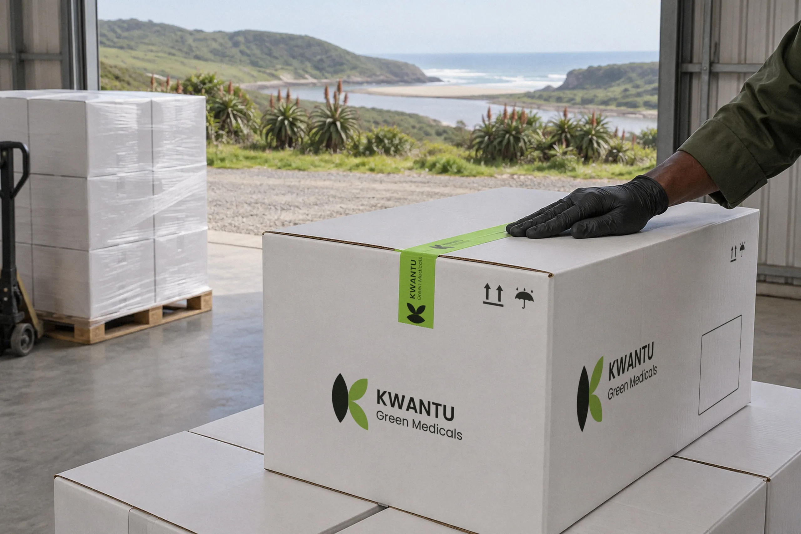
02Export cartons 
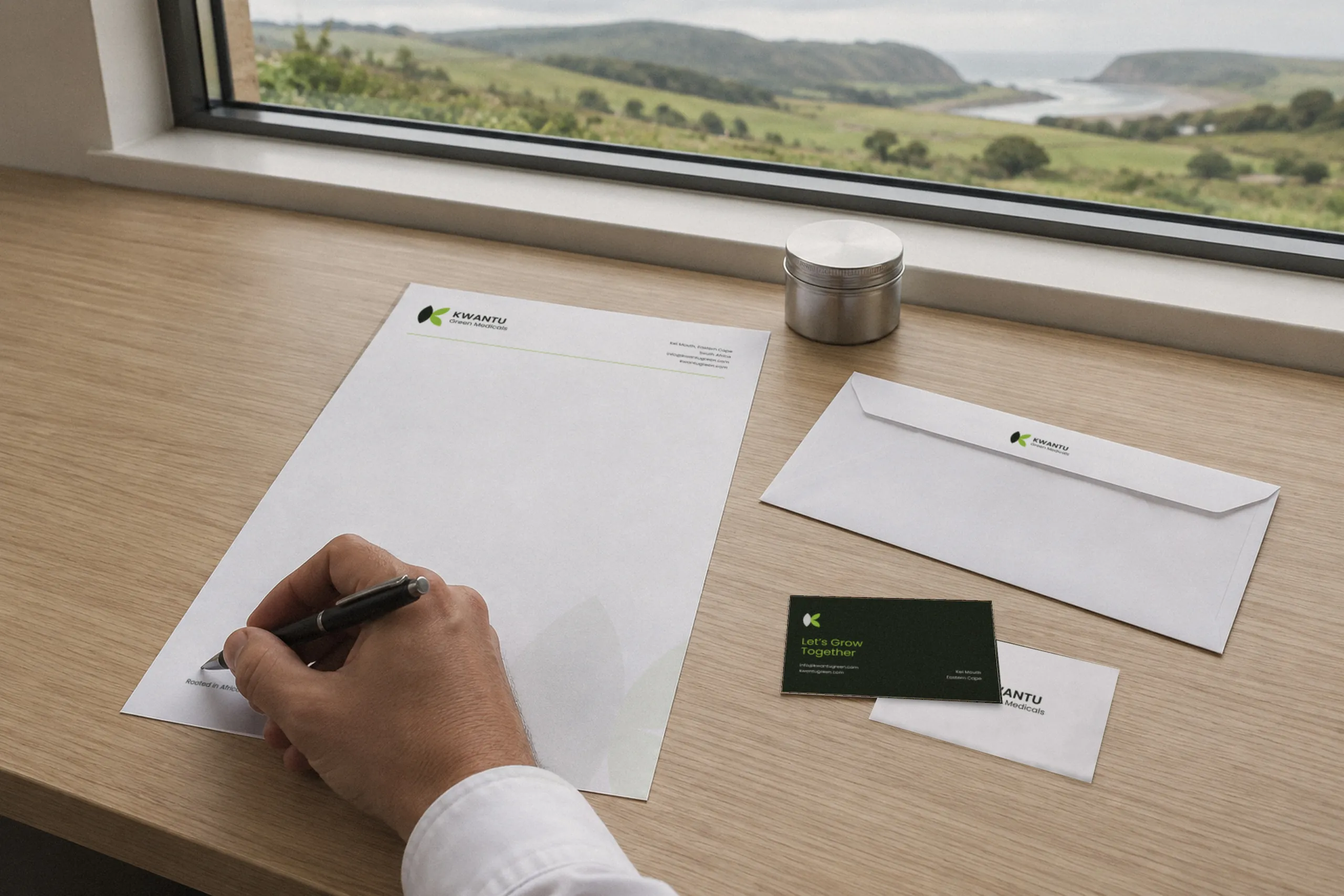
03Stationery 
04Grow room door 
05The website, in the greenhouse
The website
How a licensed buyer moves through the website
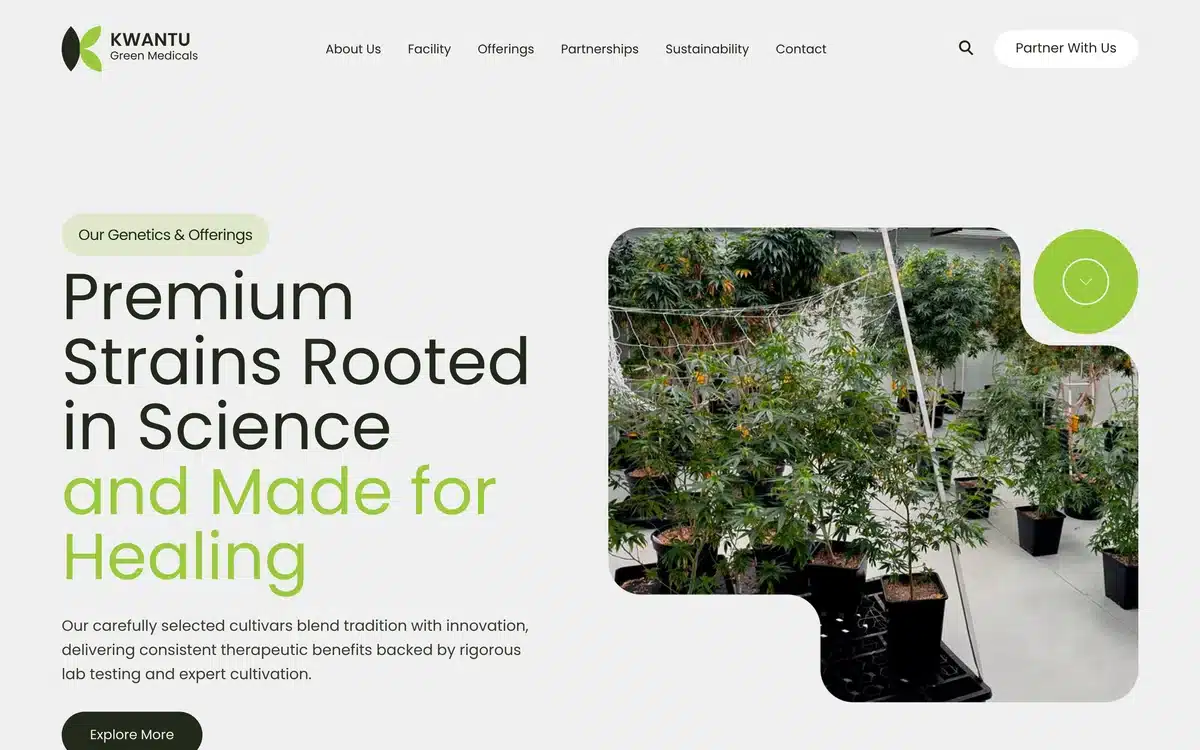
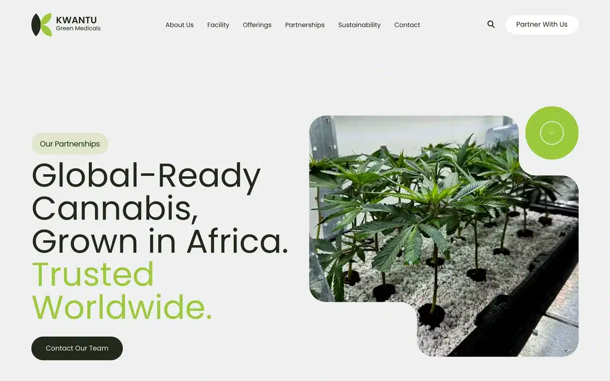
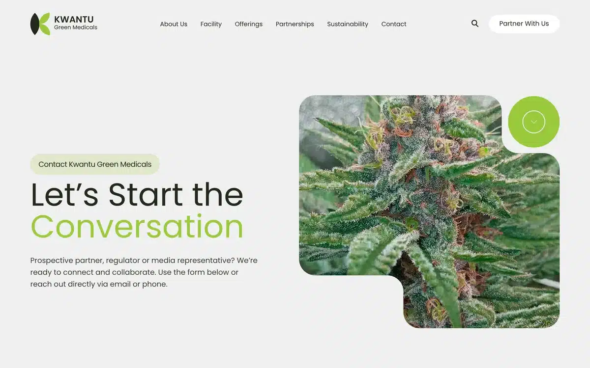
Captured from the live site: the homepage, then the route from the facility to a partner conversation.

01See the facility
kwantugreen.com/facility-and-cultivation
02Review the genetics
kwantugreen.com/genetics-and-product-offering
03Check export readiness
kwantugreen.com/export-and-global-partnerships
04Start the conversation
kwantugreen.com/contact-us
The result
Facility, products and partnerships, in one place
Prospective partners can review the facility, products and export information before making contact. The new identity carries across the website, facility and packaging.
More work to explore
Related case studies

Applied Heat / Brand refresh / Website / Product journeys
From technical product to enquiry
Geeklab refreshed Applied Heat’s brand and rebuilt its WordPress website around industrial heating products and enquiries.

Redox One / Website design / Technical storytelling
A commercial story for new energy
A website introducing Redox One’s long-duration energy storage technology to potential commercial partners.
Do specialist buyers have the information they need?
Tell us what customers need to understand about your facility, products or partnership offer. We’ll tell you how we’d organise that information for the people deciding.
A 30-minute call. No brief needed.