Case study / iSQI
A consistent presence across events, print and digital.
Our work for iSQI connects event graphics, certification flyers and social campaign artwork. A recognisable visual approach adapts to different subjects, audiences and formats.
Brand application / Campaign artwork / Print collateral
Selected work
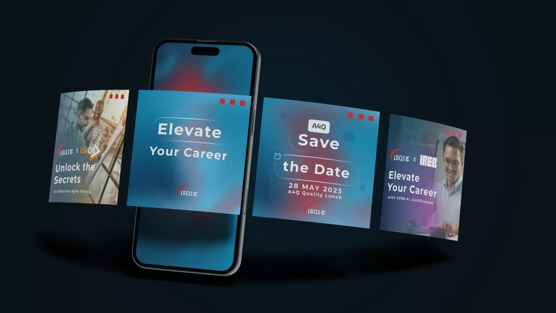
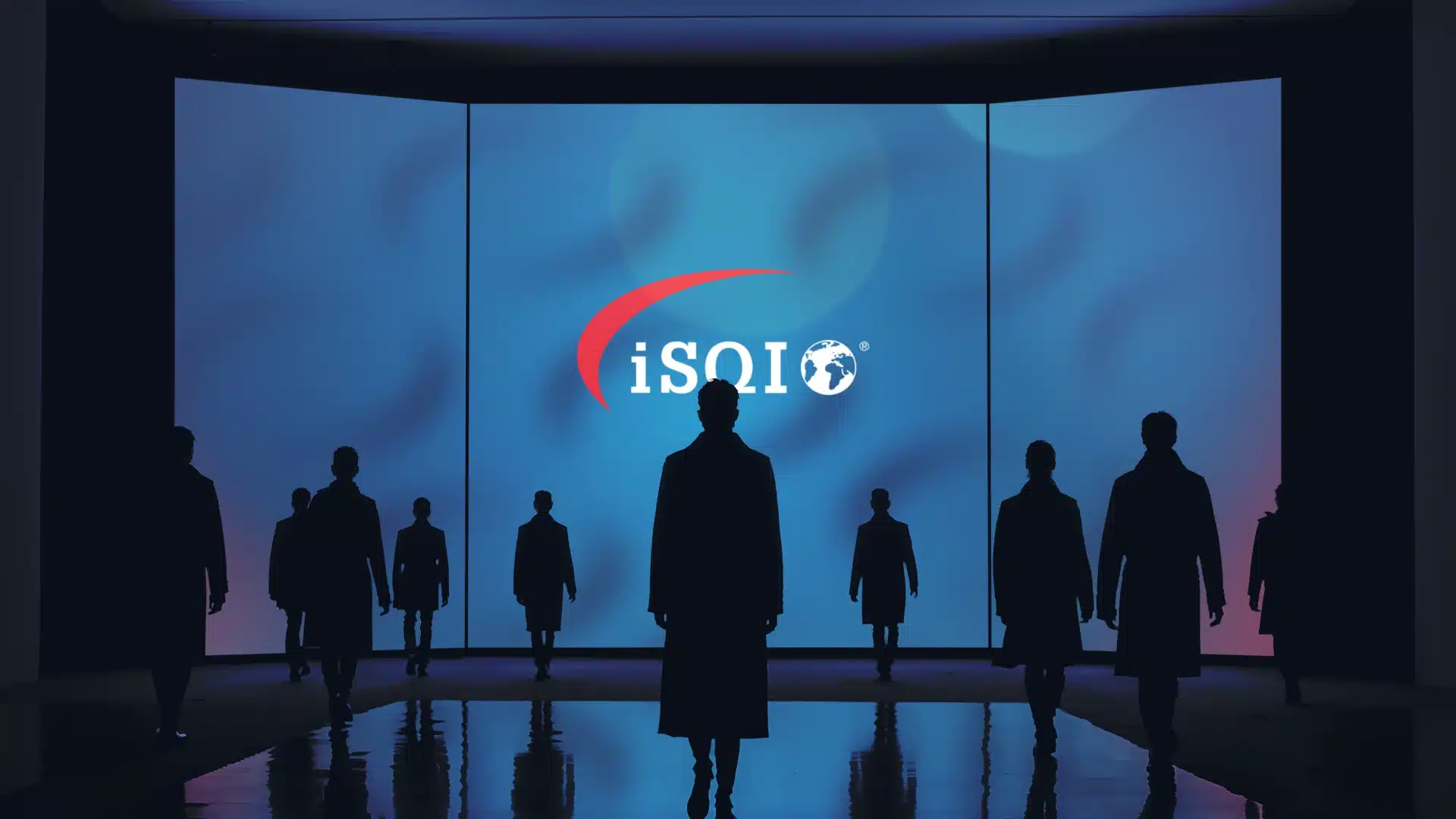
Campaign artwork and event-scale brand applications. The event setting is a design visualisation.
The context
Different messages. One recognisable presence.
iSQI communicates a broad portfolio of professional certifications across different subjects, audiences and formats. Each message needs a clear purpose while keeping the organisation recognisable wherever it appears.
Our approach
Make the format work for the message.
A blue and red palette, structured typography and recurring graphic elements connect the work. The layout changes with the medium: a prominent message for an event setting, a clear information hierarchy for a flyer, and a focused idea for a social post.
Brand in context
From exhibition scale to the smallest detail.
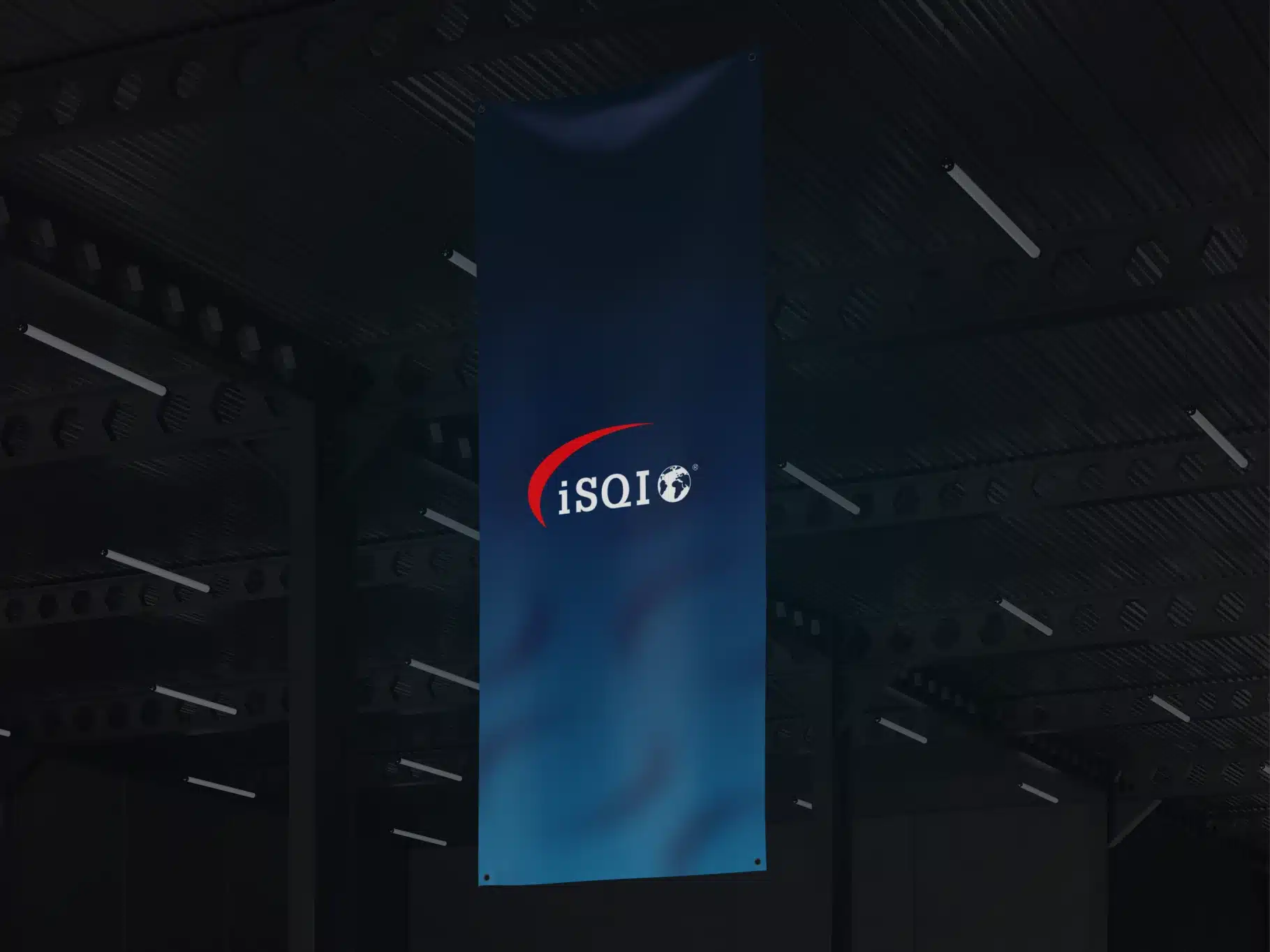
iSQI event-brand application, shown as a design visualisation.
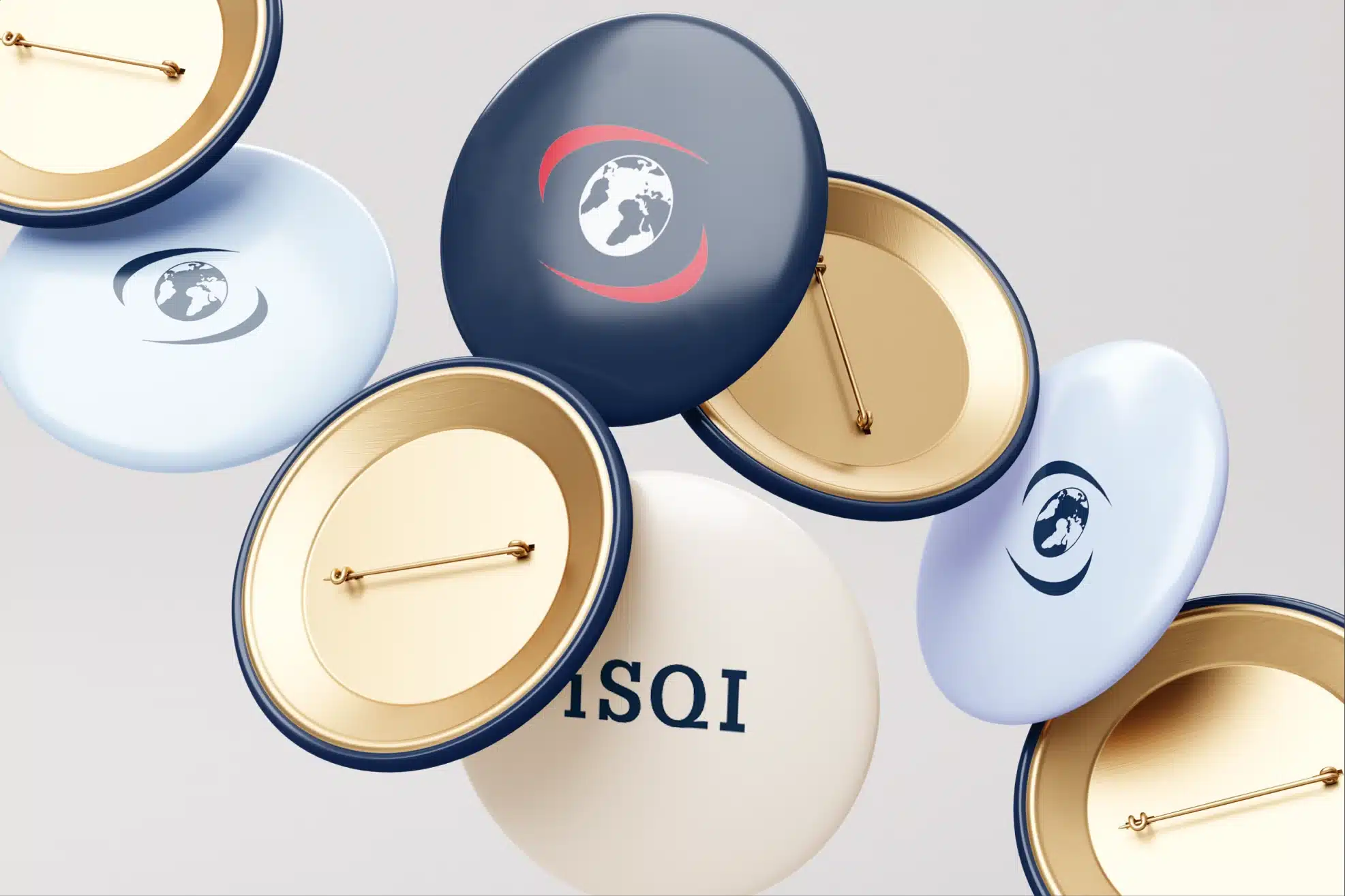
Merchandise application, shown as a design visualisation.
The work
A visual language with room to adapt.
01
Event and brand applications
Booth and event graphics bring the identity into larger spaces. The exhibition and merchandise mockups show how the artwork can appear in context, with scale and composition suited to each application.
02
Campaigns with a clear focus
Social artwork introduces different certification subjects and practical messages. A recognisable structure gives each piece a connection to iSQI while allowing its own topic to lead.
03
Detail across language versions
English and German ISTQB Prep flyers extend the design approach into more detailed collateral. The layouts accommodate different text lengths while keeping the information hierarchy clear.
What the work brings together
Connected creative across the communication mix.
The selected work connects event presentation, useful print material and recurring campaign creative through one recognisable visual approach. It shows how the same identity can support a bold introduction, a detailed explanation and an everyday digital message.
More work to explore
GASQ
One direction across brand and web.
Website, brand and ongoing digital support for a specialist software-testing certification body.
A4Q
Find the qualification that fits.
Geeklab rebuilt A4Q’s public website around the needs of professionals, training providers and partners.
Your next project
Does your brand hold together across every format?
Tell us where your campaigns, event graphics and everyday communications need a clearer shared direction. We’ll discuss the creative work that could help bring them together.
A 30-minute conversation about your priorities, fit and the next step. You do not need a finished brief.